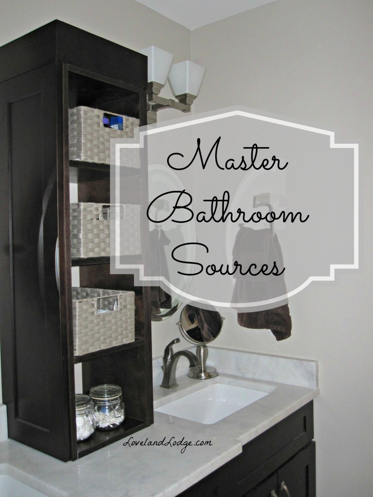
I’m finally finishing wrapping up the master bath project and sharing my sources! I still have a little left to do in the space, mainly find some artwork for the wall. I’ve been looking around, but haven’t found anything perfect yet. I’m also debating switching the towels out to white instead of brown. These weren’t new towels I bought for the space and they still match the other bathroom so I’d definitely keep them. I’m thinking crisp white towels will give it a hotel feel that’s so much fun to have at home.
In terms of sources, I knew I wanted to play up the square theme since we’d be going with square sinks. I really liked the look as it gives it a traditional, yet modern feel, and isn’t too feminine. I ended up loving the Delta Dryden line so went with this for a lot of the fixtures, or something similar.
- Cabinet Hardware: I found these pulls, knobs and the robe hooks at Lowe’s and loved the way they mimicked the square finish on the faucets. They were also really affordable, which made me (and my husband) happy.
- Cabinets: The cabinets are Espresso in Shaker style from US Cabinet Depot. These are the same ones as the kitchen, but in a different color and I really like the continuity in the house. Can’t wait to do the hall bath (one day!) so they all match.
- Towel Racks: I ended up going with the Delta Dryden matching towel racks for ease. I found these on Amazon and bought one for each side of the sink. I will say that they are a bit bigger than I was anticipating, and they don’t hinge, which is kind of annoying. But in terms of looks, they can’t be beat!
- Lighting: I found these lights from Lamps Plus and they were a perfect size and price. I had to be very careful with the lights I ordered because of width. Since the shelving was in the middle, I had to get something pretty narrow to put above each sink. And, while single lights would’ve made the most sense, since we don’t get any natural light in the bathroom, I knew we needed at least 4 lights. They ended up getting hung facing up, even though I originally thought I wanted them facing down. We tried it and it just didn’t look right. The good news is that I don’t really see much of a difference in the lighting and I can still see to do my make-up just fine.
- Faucets: These faucet fixtures are probably my second favorite thing in the bathroom (the glass tile being the first). The Dryden faucets were really the inspiration for the rest of the fixtures. Both my husband and I really like the single handle as well. And bonus, less to clean!
- Mirrors: As with the lights, I had to be really careful on the width of the mirrors due to the shelving in the middle. For whatever reason, I was having a really hard time finding mirrors with brushed nickel hardware. Plenty of bronze and chrome out there, but my choices were really limited in the nickel category.
- Shower head: I debated for quite some time on what type of shower head to get. I knew I wanted a handheld option, but wasn’t sure I wanted to invest in the separate handheld. If I had it to do over again, I think this is the one thing I’d change. Don’t get me wrong - I love it and it works great, but I wish I’d splurged a little bit and got the full Dryden set. (Note: I couldn’t find the right shower head to share, but this one is similar, but ours in brushed nickel)
And that’s a wrap on the master bathroom renovation! Thanks for following along and I’ve appreciated all your comments on the renovations!

[…] here are some updated pictures of the master bath now. You can see all the before and afters here, here & […]